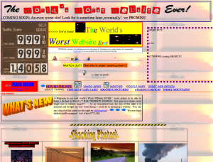
The World’s Worst Website Ever

I stumbled across this site a while ago – and had fun pulling it apart trying to find out everything ‘wrong’ with it. Although a lot of it is personal opinion – and you can have your site however you want, there are so many things on this site that would need to be ‘fixed’ in order to improve user experience and to prevent migraines for a majority of your readers.
I’m going to attach a list here – and if your site commits any of these crimes (or many of them), you should be talking to a developer pronto. Without any ado, here is my top 20 issues with “The World’s Worst Website Ever”:
1. Everything justified to the left
2. ‘Stacked’ content, with no regards to rows or columns
3. So… many… fonts…
4. No clear navigation
5. Way, way too many calls to action.
6. So… many… colors…
7. Borders, Horizontal rules, more borders
8. Tiled background
9. Animated GIF’s, random animated GIF’s, more random animated GIF’s
10. CAPS ON TOO MUCH
11. Seizure inducing flashing animated GIF’s
12. I had my sound muted, so this should have been much higher on the list – the midi sound playing in the background is a serious violation of your website, and will result in more people leaving your site immediately than yelling ‘movie’ in a ‘crowded firehouse’.
13. Site under construction – ha.
14. Badly formatted images, pixelated edges
15. No standard font or sizes of text – anywhere.
16. Poor grammar, poor spelling
17. No real sense of what… the site… is.
18. Odd spacing of text, everything seems so broken.
19. Highlighted text, again – random – seemingly to grab your attention? : )
20. …this one is a bit nerdy, but the code is horrendous. So many inline styles – and most all scripts run inline. Overall – just very, very bad!
I hope you enjoyed the site – if you have any of these on your site – make sure to get on the internet and find yourself a developer. Before you jump on board and sign any contracts, make sure to get all your questions answered, and ask for any referrals – as you wouldn’t have a stranger take control of your credit score, and your business’ online presence is no different. Ask other customers what they think of the service they are provided, and only proceed when you’re certain that you’re going to be treated fairly, and not ‘held hostage’ by your developer. Don’t laugh – it happens quite a bit. Developers get done with a project, and they walk away – or are ‘too busy’ to handle anything else. You want to make sure that your site is in good hands, and will be for years to come.

