The third time is a charm

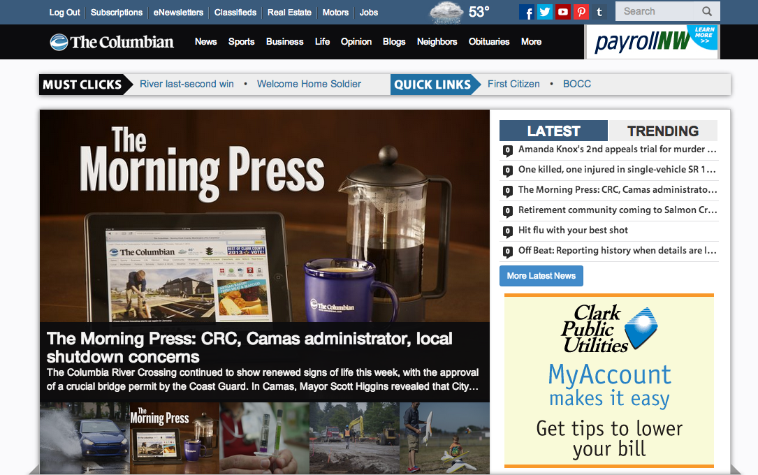
Today we unveiled a new look for columbian.com. It is our third redesign of the site since 2008, and we’re admittedly biased but we think it’s the best one yet. We hope you agree.
Our latest endeavor comes as all our consumption of news and information is becoming increasingly more mobile. Just a few years ago, a small percentage of people came to our site from a smartphone and no one came from a tablet. Today, nearly a third of you visit our site using a portable device. This is happening all over the country and some predict that by next year as much as 50% of the traffic on the Internet could be mobile.
We built our current site with this in mind. The templates used to house our content are what industry types call “responsive.” This simply means that when you hit our site the display of the content adjusts to fit the size of the screen you’re using. If you’re on a desktop or laptop, you see more content in your window than you would if you’re on an iPad or smartphone. If you are using a portable device, though, you still see the same content. It’s just shifted around to better fit your screen. To see it in action on your desktop, just resize your browser window to make it narrower and narrower and watch the content move into new spots.
For nerds like me, this is cool. You, however, might better appreciate other facets of our redesign like the new menu or navigation bar at the top of each page that we think makes it easier to find stuff on the site, or maybe the new headline font we’re using that is hopefully easier to read. If you’re on a phone or tablet, you can now use the swipe gesture to scroll through our photos more easily and we’ve tricked out things to display some secondary content that hadn’t shown up before on mobile devices (for example, a text box or “sidebar” with more information that may not be in a story).
To learn more about what we’ve changed you can take our tour or watch this promotional video in which we tried to poke a little fun at Apple with it’s overwrought promotional videos on their new products like this one on the iPhone 5c.
Whether you take the tour or not, we do hope you’ll provide us with some feedback and tell us what you think. The feedback button can be found with the blue tour button in the lower right side of the home page. We want to hear from you so we can fix anything that’s not working as it should or improve on things where possible. We want you to enjoy visiting our site, so don’t be shy.
