RTC: Boldly joining the 21st century

Visiting the Southwest Washington Regional Transportation Council’s website is like stepping back in time.
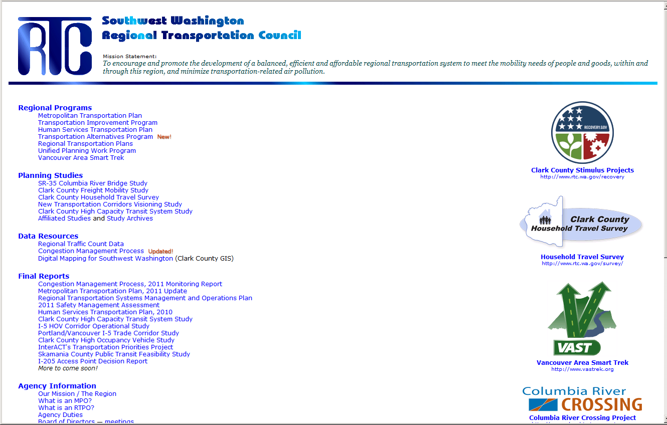
Back to a time when cell phones were used for phone calls, when The Columbian had just become a morning paper, and Tim Leavitt was a newbie on the Vancouver Planning Commission. And government websites looked something like this:

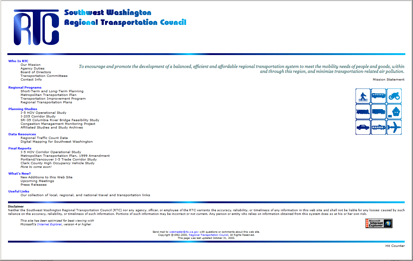
Oops, my mistake. That’s actually what the RTC website looks like today. Here’s a screenshot from the same website as it looked in December 2000, 13 years ago:

Yeah, I don’t see much of a difference, either.
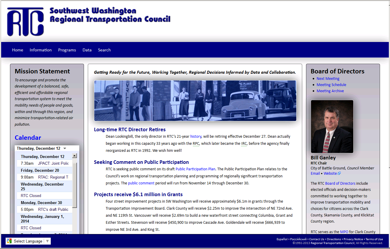
Fortunately, the agency has decided it’s finally time for an upgrade. Some time in the near future, the RTC website will look something like this:

The new site hasn’t gone live just yet, but it appears to be a marked improvement. There’s a totally new design, with (gasp!) photos, even translated versions in Spanish or Russian. And that portrait on the right, along with the main photo, is rotating — a different RTC board member smiling at you every time you open the page!
Let me be the first to welcome the RTC website into the 21st century. Now, about that logo…
