Tracking how we voted with Twitter

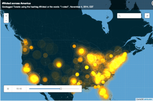
The USA Today culled together thousands (millions?) of Tweets yesterday for the 2014 general election and they produced this spiffy time-lapse data visualization.
I couldn’t help but be struck by a few things:
1) Beacons popping up in Canada, Mexico, the Caribbean and down into South America. And if you widen out to a global view you see quite a bit of activity in Europe, and even some in India, Africa and Southeast Asia.
2) Just how many more people live east of the Mississippi River.
3) There are apparently people in places like Montana and Idaho that do use Twitter.
4) And last but not least, Twitter usage is unsurprisingly concentrated in urban centers, where there’s better cellular coverage and higher rates of adoption with new technology. But when I saw that I also had to wonder if Twitter is more frequently used in blue areas of the country versus red. The Washington Post recently chimed in on this subject, suggesting Twitter is for liberals and Pinterest for conservatives. Meanwhile, Facebook is used by everyone when it comes to getting news.

