
America, on the move
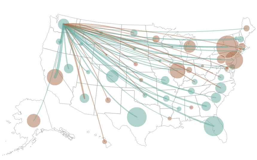

We dig maps, especially interactive maps, so when I stumbled upon a new interactive map showing state-to-state migration I just had to share. Above you can see a snapshot showing which state newcomers to Washington have come from, and which states are gaining people from Washington. If you see a brown dot on a state, that means we gained people from that state. Blue means they gained people from our state.
Data whiz Christopher Ingraham of the Brookings Institution created the map last November. According to the 2012 Census data used for the map, Washington gained 35,032 people from other states that year, making it the third most-popular destination for Americans on the move. Not surprisingly, many of those newcomers — nearly a third — came from California.
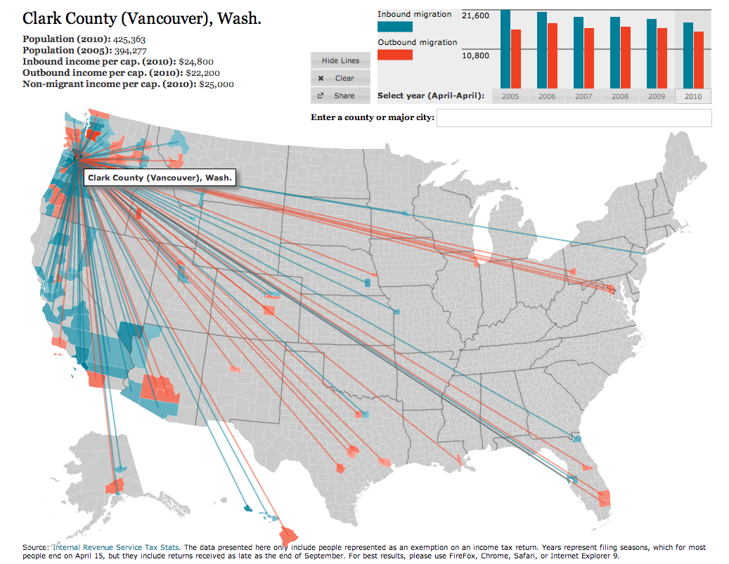
Ingraham isn’t the only one, though, to create a visualization of state migration patterns. If you want to see a county-to-county migration, Forbes offers up such a granular view (see image to right).
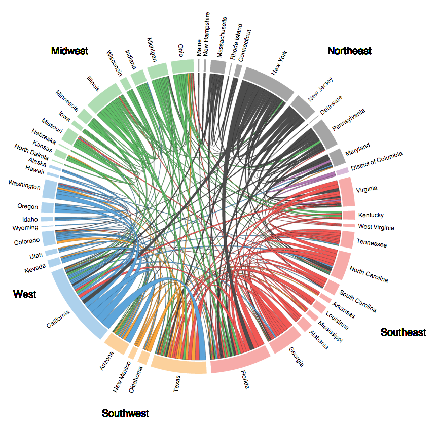
For an entirely different view of state-to-state migration that isn’t in map form, take a look at “Restless America” by Chris Walker on vizynary (see image below).
John Hill
John is the web and photo editor at The Columbian, where he has worked since 1995 in various roles. A journalist for the past 25 years, he's a fan of good storytelling, data, graphics and still likes to read an actual newspaper. Twitter: @hilljohng